Flutter Container widget is a versatile and powerful widget in Flutter that allows you to create a rectangular visual element. It can be used to add padding, margins, borders, background colors, shapes, and other visual decorations to your widgets. Essentially, it acts as a container for other widgets and allows you to style and position them as needed.
In this blog post, we will dive deep into the Container widget, exploring all its properties and showcasing examples to help you master its usage.
Key Features of the Container Widget in Flutter
- Customizable Appearance: With Container, you can easily set background colors, gradients, and even images.
- Flexible Sizing: Control the width and height of your elements with precision.
- Padding and Margins: Add space inside or around your widgets effortlessly.
- Borders and Shapes: Create rounded corners, circular shapes, or custom border styles.
- Child Positioning: Align your child widgets within the Container as needed.
Basic Usage
Let’s start with a simple example to see how a Container works in Flutter:
import 'package:flutter/material.dart';
void main() {
  runApp(MyApp());
}

class MyApp extends StatelessWidget {
  @override
  Widget build(BuildContext context) {
    return MaterialApp(
      home: Scaffold(
        appBar: AppBar(
          title: Text('Container Widget Example'),
        ),
        body: Center(
          child: Container(
            width: 200,
            height: 200,
            color: Colors.blue,
            child: Center(
              child: Text(
                'Flutter Stuff',
                style: TextStyle(color: Colors.white),
              ),
            ),
          ),
        ),
      ),
    );
  }
}
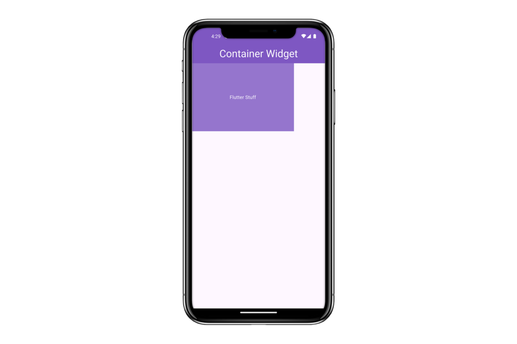
In this example, we’ve created a Container with a width and height of 200 pixels and a purple background color. Inside the Container, we have a Text widget centered both horizontally and vertically.
Properties of the Flutter Container Widget
The Container widget comes with many properties that allow you to customize its appearance and behavior. Let’s go through each property in detail, with examples illustrating their usage.
1. alignment
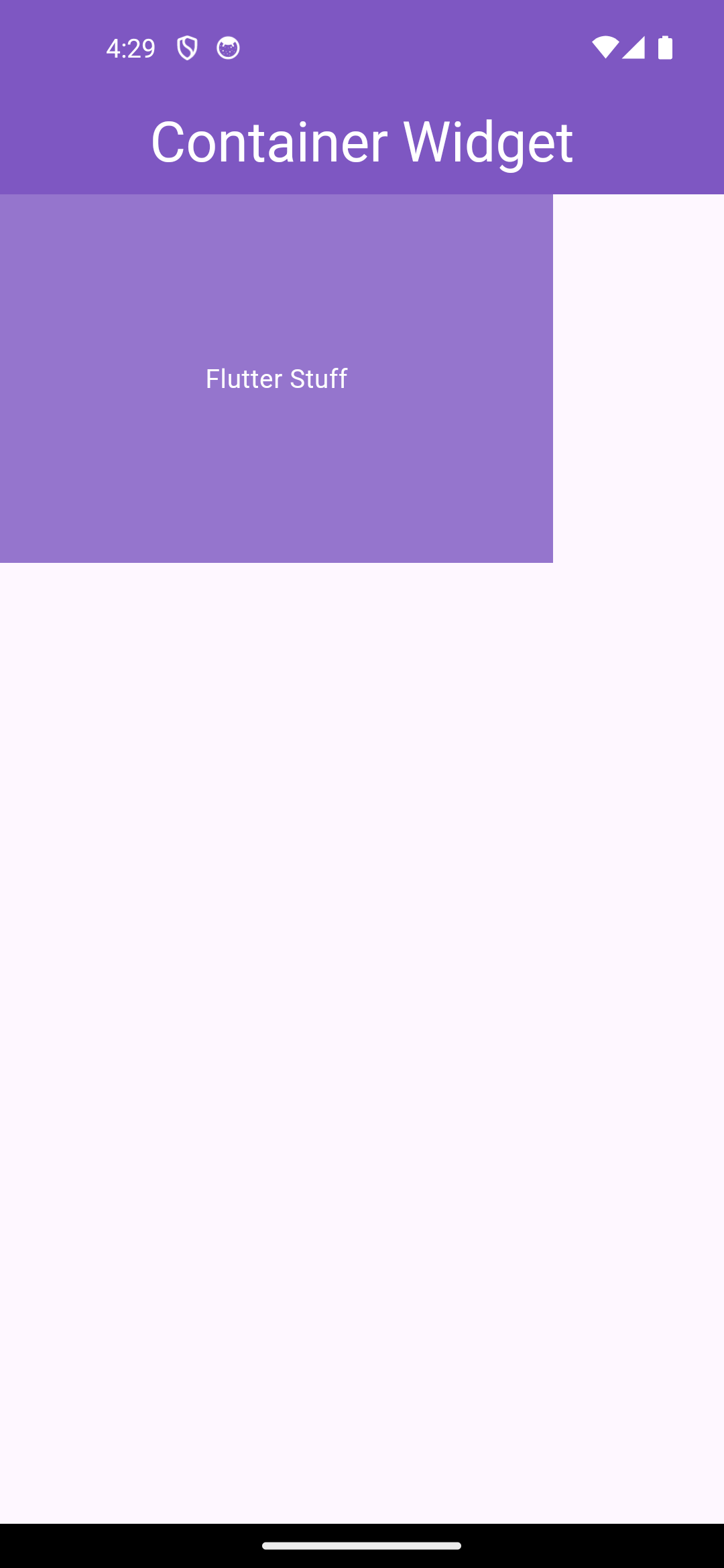
The alignment property is used to align the child widget within the Container. You can use the Alignment class to specify the alignment. That does not align the container but that alignment property will align the child widget of the container like you see the text child is aligned in the center when you pass an alignment property.
To align the container in the center you have to wrap the container widget with the center widget so that it can easily be aligned. So the below example is for aligning the child widget not for the container in the center.
Example #1: Centering the child property of the container using the alignment property of the container
#aligning the child widget in the center
Container(
            alignment: Alignment.center,
            height: 200,
            width: 300,
            color: Colors.deepPurple.shade300,
            child: const Text(
              'Flutter Stuff',
              style: TextStyle(color: Colors.white),
            ),
          ),
Example #2: Centering the Contair by wrapping the container with the center widget
#aligning the container here also in the center
Center(
        child: Container(
          alignment: Alignment.center,
          height: 200,
          width: 300,
          color: Colors.deepPurple.shade300,
          child: const Text(
            'Flutter Stuff',
            style: TextStyle(color: Colors.white),
          ),
        ),
      ),
    );
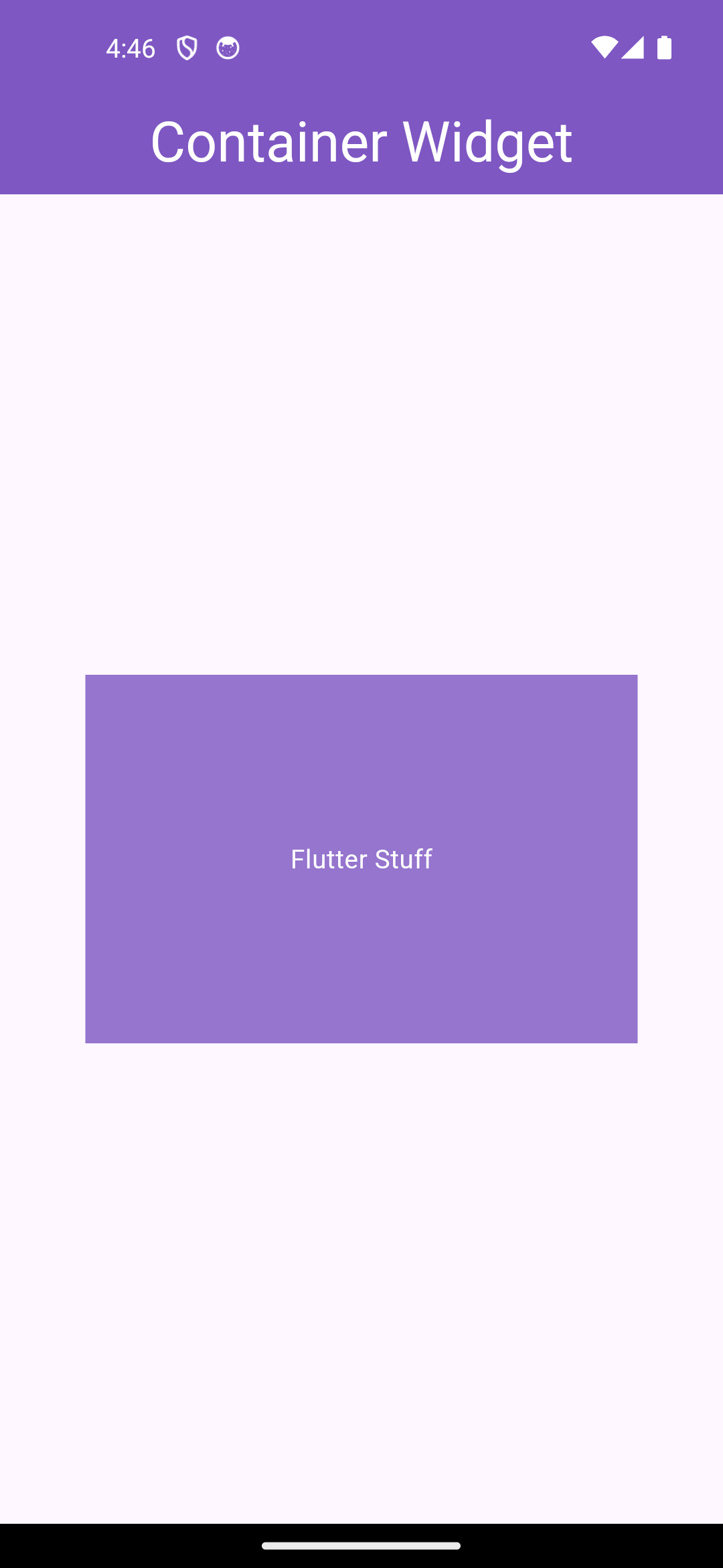
In this example, the Text widget which is the child widget, not the container itself is centered within the Container.
2. padding
The padding property is used to add padding inside the Container. You can use the EdgeInsets class to specify the padding values. The padding and margin are two different things so don’t mix that the padding is inside of the container and the margin is outside of the container.
The padding was assigned to all sides of the container and to one specific side of the container wherever you want to add the padding.
Example:
     Center(
        child: Container(
          padding: const EdgeInsets.all(16.0),
          height: 200,
          width: 300,
          color: Colors.deepPurple.shade300,
          child: const Text(
            'Flutter Stuff',
            style: TextStyle(
              color: Colors.white,
              fontSize: 20,
            ),
          ),
        ),
      ),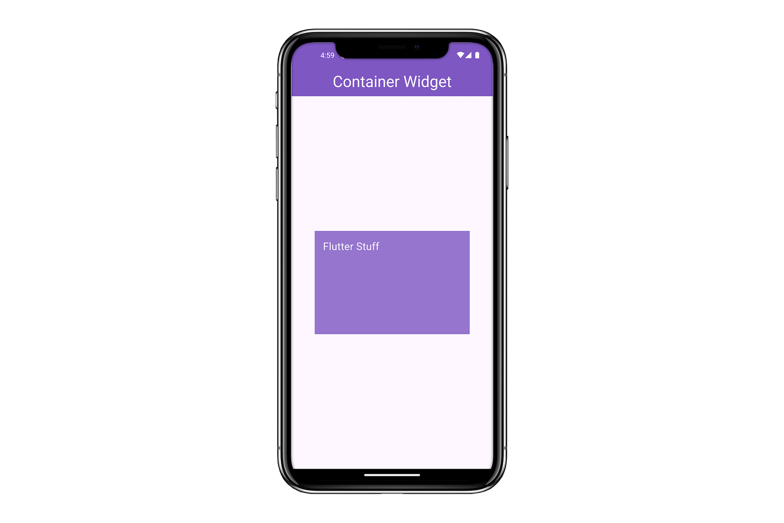
Here, we have added 16 pixels of padding on all sides of the Text widget inside the Container.
3. color
The color property sets the background color of the Container. You can also see that the background color of the container doesn’t have a specific background color property but actually, we use the color property of the container as a background color.
That color also has further properties like you can change the opacity of the color of the container you can check the other properties of the color property of the container by adding the “.” dot after the color property.
Example:
   Column(
        mainAxisAlignment: MainAxisAlignment.center,
        children: [
          Center(
            child: Container(
              padding: const EdgeInsets.all(16.0),
              height: 100,
              width: 200,
              color: Colors.deepPurple.shade300,
              child: const Text(
                'Flutter Stuff',
                style: TextStyle(
                  color: Colors.white,
                  fontSize: 20,
                ),
              ),
            ),
          ),
          Center(
            child: Container(
              padding: const EdgeInsets.all(16.0),
              height: 100,
              width: 200,
              color: Colors.deepPurple.shade500,
              child: const Text(
                'Flutter Stuff',
                style: TextStyle(
                  color: Colors.white,
                  fontSize: 20,
                ),
              ),
            ),
          ),
          Center(
            child: Container(
              padding: const EdgeInsets.all(16.0),
              height: 100,
              width: 200,
              color: Colors.deepPurple.shade900,
              child: const Text(
                'Flutter Stuff',
                style: TextStyle(
                  color: Colors.white,
                  fontSize: 20,
                ),
              ),
            ),
          ),
        ],
      ),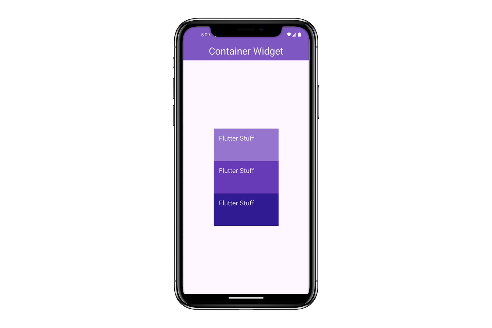
In this example, the Container has a different background color.
4. decoration
The decoration property allows you to add more complex styling to the Container using the BoxDecoration class. That BoxDecoration Class has further properties such as :
- Color? color,
- DecorationImage? image,
- BoxBorder? border,
- BorderRadiusGeometry? borderRadius,
- List<BoxShadow>? boxShadow,
- Gradient? gradient,
- BlendMode? backgroundBlendMode,
- BoxShape shape = BoxShape.rectangle,
Example:
 Center(
        child: Container(
          width: 300,
          height: 200,
          decoration: BoxDecoration(
              shape: BoxShape.rectangle,
              color: Colors.deepPurple.shade300,
              borderRadius: BorderRadius.circular(12),
              boxShadow: [
                BoxShadow(
                  color: Colors.black.withOpacity(0.5),
                  spreadRadius: 2,
                  blurRadius: 8,
                  offset: const Offset(4, 4),
                ),
              ],
              border: Border.all(
                color: Colors.black45,
                width: 2,
              )),
          child: const Center(
            child: Text(
              'Flutter Stuff',
              style: TextStyle(
                color: Colors.white,
                fontSize: 25,
              ),
            ),
          ),
        ),
      ),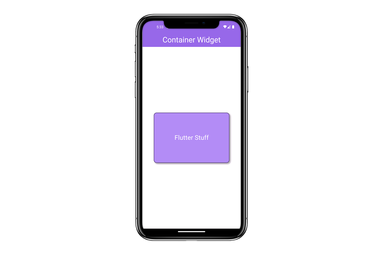
In this example, we have added a red background color, rounded corners with a radius of 12 pixels, and a shadow effect to the Container and more.
5. constraints
The constraints property allows you to set size constraints on the Container using the BoxConstraints class. This is the most common size constraint in Flutter widgets. BoxConstraints define a minimum and maximum size for a widget, limiting its width and height within those limits.
The BoxConstraint will have 4 doubles means and max height and width and min-height and widget The max height and width means that the widget does not exceed from that width and height and min-height and width means that the widget has that minimum height and widget below that the size can’t be reduced of that widget.
Example:
  Center(
        child: Container(
          constraints: const BoxConstraints(
            minWidth: 100,
            maxWidth: 300,
            minHeight: 100,
            maxHeight: 200,
          ),
          decoration: BoxDecoration(
            shape: BoxShape.rectangle,
            color: Colors.deepPurple.shade300,
            borderRadius: BorderRadius.circular(12),
          ),
          child: const Center(
            child: Text(
              'Visit Flutter Stuff',
              style: TextStyle(
                color: Colors.white,
                fontSize: 25,
              ),
            ),
          ),
        ),
      ),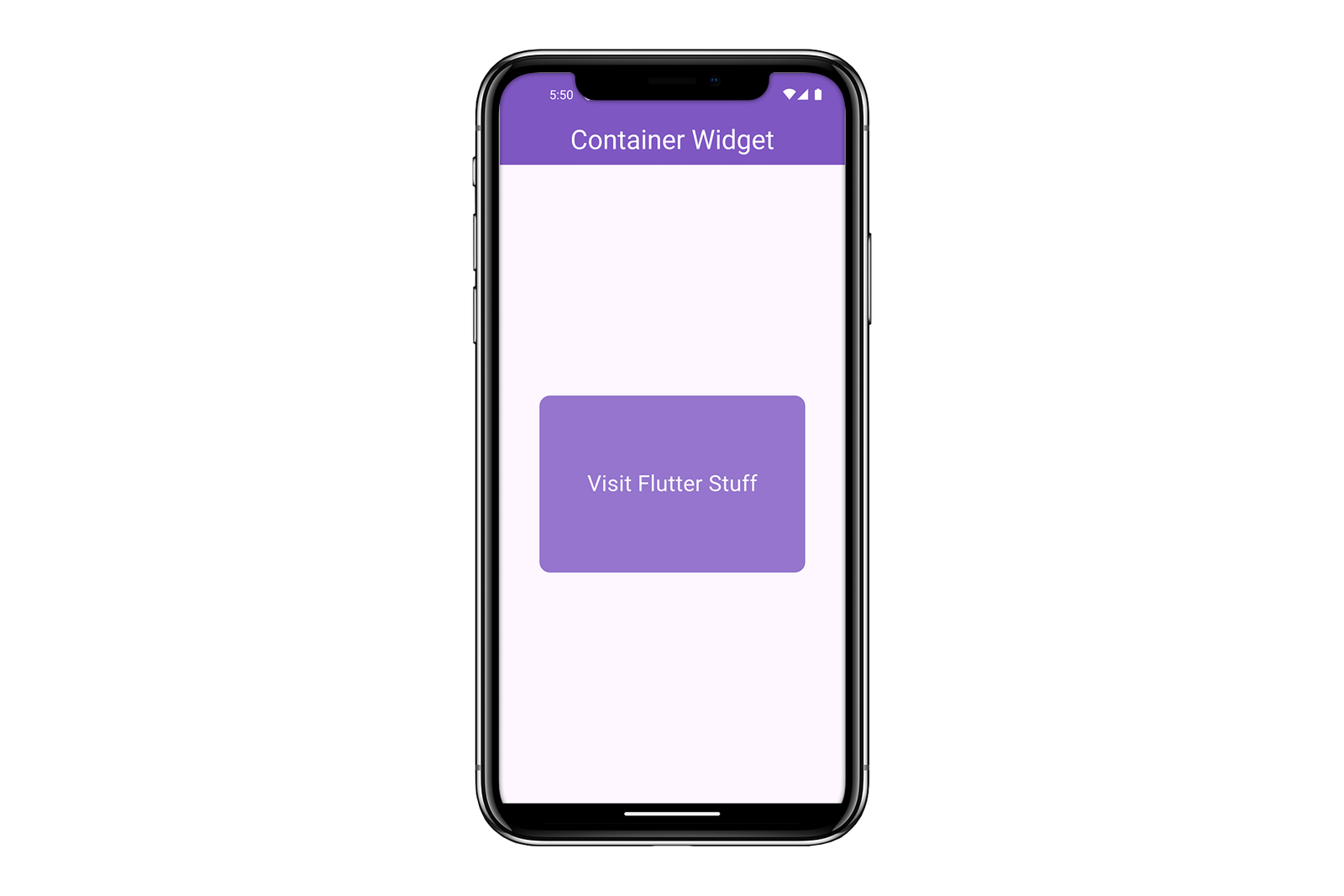
In this example, the Container has minimum and maximum width and height constraints.
6. margin
The margin property is used to add margin outside the Container. You can use the EdgeInsets class to specify the margin values. You can add the margin by all sides equally using the .all property and also assign the margin to the specific side of the container widget.
Example:
    Container(
        margin: const EdgeInsets.all(16.0),
        width: 200,
        height: 200,
        color: Colors.deepPurple.shade300,
        child: const Center(
          child: Text(
            'Flutter Stuff Margin',
            style: TextStyle(color: Colors.white),
          ),
        ),
      ),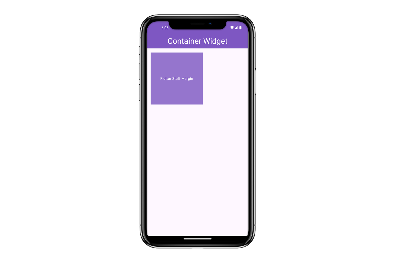
Here, we have added 16 pixels of margin on all sides of the Container.
7. width and height
The width and height properties are used to set the width and height of the Container. By default, the container has height and width according to their child widget but we can assign the height and width also according to our requirement using the height and width property of the container widget in Flutter.
Example:
   Center(
        child: Container(
          width: 200,
          height: 200,
          color: Colors.deepPurple.shade300,
          child: const Center(
            child: Text(
              'Container height width',
              style: TextStyle(color: Colors.white),
            ),
          ),
        ),
      ),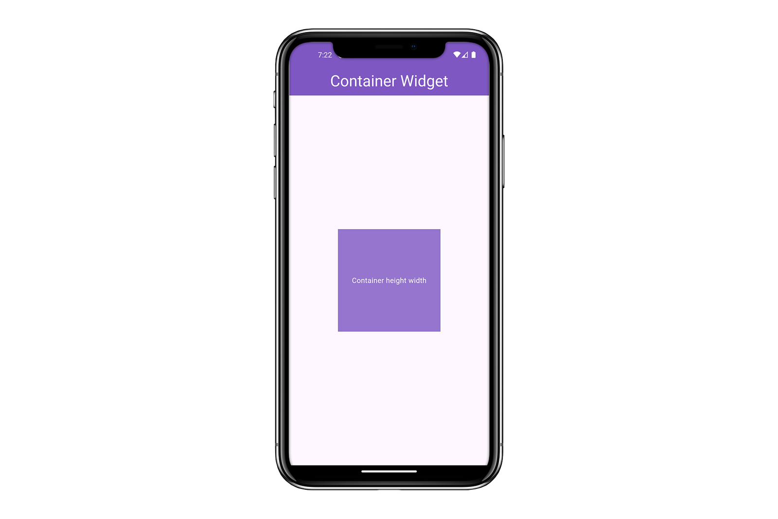
In this example, the Container has a width of 200 pixels and a height of 200 pixels.
8. transform
The transform property allows you to apply a transformation matrix to the Container, such as scaling, rotating, or translating it. The transform widget will rotate the container in any direction and in the below example, we rotate the container in the z-direction.
By transforming the container you can assign a new lool to the container according to their need and make it more attractive and make sure one thing while transforming the container widget the app responsiveness will not affected.
Example:
   Center(
        child: Container(
          height: 200,
          width: 300,
          transform: Matrix4.rotationZ(0.1),
          decoration: BoxDecoration(
              color: Colors.deepPurple.shade300,
              borderRadius: BorderRadius.circular(12),
              border: Border.all(color: Colors.white)),
          child: const Center(
            child: Text(
              'Tranform Widget Flutter Stuff',
              style: TextStyle(
                color: Colors.white,
                fontSize: 20,
              ),
            ),
          ),
        ),
      ),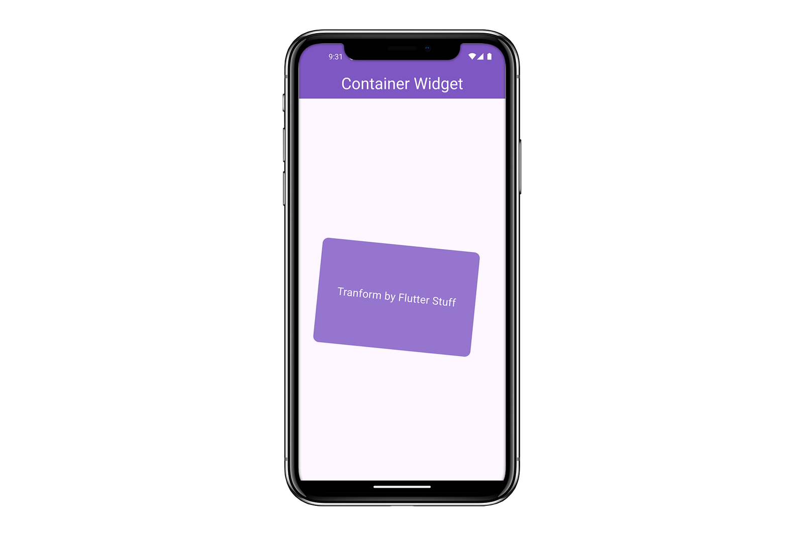
In this example, the Container is rotated slightly using the Matrix4.rotationZ method.
Check Out: Flutter Food App UI Design with source code
9. child
The child property is used to specify the widget that will be contained within the Container. This means that whatever the widget or the specific thing you want to display on the container we assign it to the child property of the container. That child property will further accept any widget so the user can assign any widget to that child of the container
Example:
Container(
        margin: const EdgeInsets.all(20),
        alignment: Alignment.center,
        height: 200,
        width: 300,
        decoration: BoxDecoration(
            color: Colors.deepPurple.shade300,
            borderRadius: BorderRadius.circular(12),
            border: Border.all(color: Colors.white)),
        child: const Text(
          'Comment any query',
          style: TextStyle(
            color: Colors.white,
            fontSize: 20,
          ),
        ),
      ),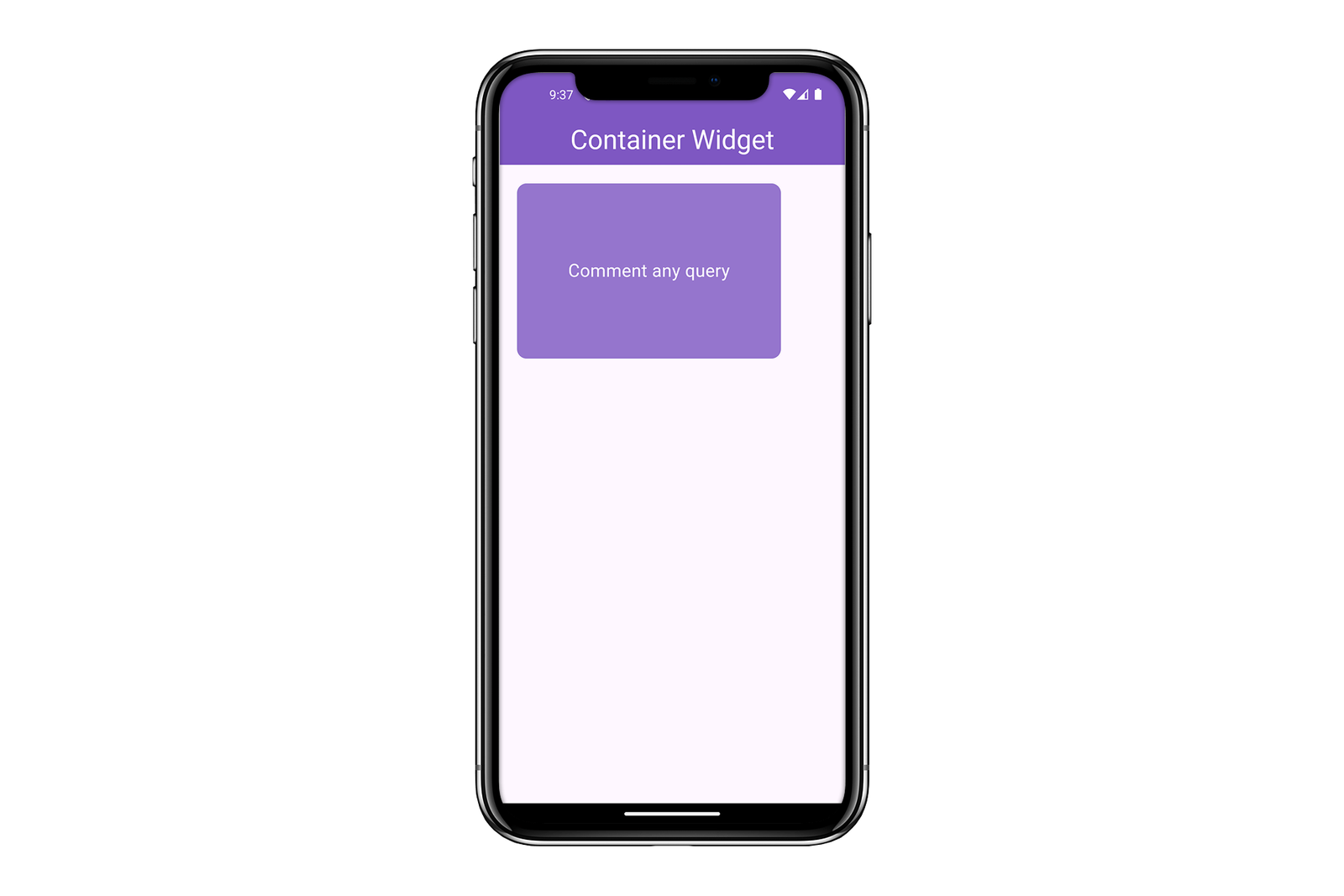
In this example, the Text widget is the child of the Container.
Advanced Usage of Flutter Container and Examples
Now that we’ve covered the basic properties of the Container widget, let’s explore some more advanced examples to see how you can combine these properties to create complex and visually appealing layouts.
Example 1: Creating a Card-Like Layout using Flutter Container
Center(
        child: Container(
          height: 220,
          width: double.infinity,
          margin: const EdgeInsets.all(16.0),
          padding: const EdgeInsets.all(16.0),
          decoration: BoxDecoration(
            color: Colors.deepPurple.shade200,
            borderRadius: BorderRadius.circular(12),
            border: Border.all(color: Colors.deepPurple),
            boxShadow: [
              BoxShadow(
                color: Colors.black.withOpacity(0.3),
                spreadRadius: 2,
                blurRadius: 8,
                offset: const Offset(0, 4),
              ),
            ],
          ),
          child: Column(
            crossAxisAlignment: CrossAxisAlignment.start,
            children: [
              const Text(
                'Title: Flutter Stuff',
                style: TextStyle(
                    fontSize: 25,
                    fontWeight: FontWeight.bold,
                    color: Colors.white),
              ),
              const SizedBox(height: 8),
              const Divider(color: Colors.black),
              const Text(
                'Description: This is a card-like layout using a Container widget. It has padding, margin, and a box shadow.',
                style: TextStyle(
                  color: Colors.white,
                ),
              ),
              const SizedBox(height: 20),
              SizedBox(
                  height: 40,
                  width: double.infinity,
                  child: ElevatedButton(
                      onPressed: () {},
                      child: const Text('visit to read more')))
            ],
          ),
        ),
      ),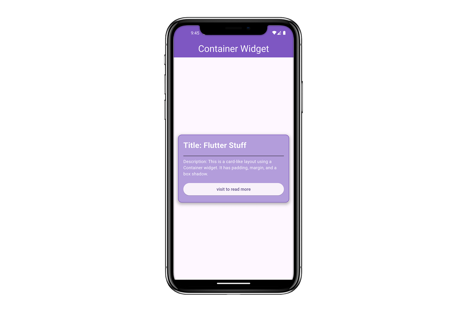
In this example, we create a card-like layout with a light purple background, rounded corners, padding, margin, and a subtle shadow effect. Inside the Container, we use a Column widget to arrange the text elements vertically.
Example 2: Creating a Circular Avatar using Flutter Container Widget
Center(
        child: Container(
          width: 200,
          height: 200,
          decoration: BoxDecoration(
            border: Border.all(color: Colors.deepOrange.shade300, width: 5),
            shape: BoxShape.circle,
            image: const DecorationImage(
              image: NetworkImage(
                  'https://img.freepik.com/free-psd/3d-illustration-human-avatar-profile_23-2150671122.jpg'),
              fit: BoxFit.cover,
            ),
          ),
        ),
      ),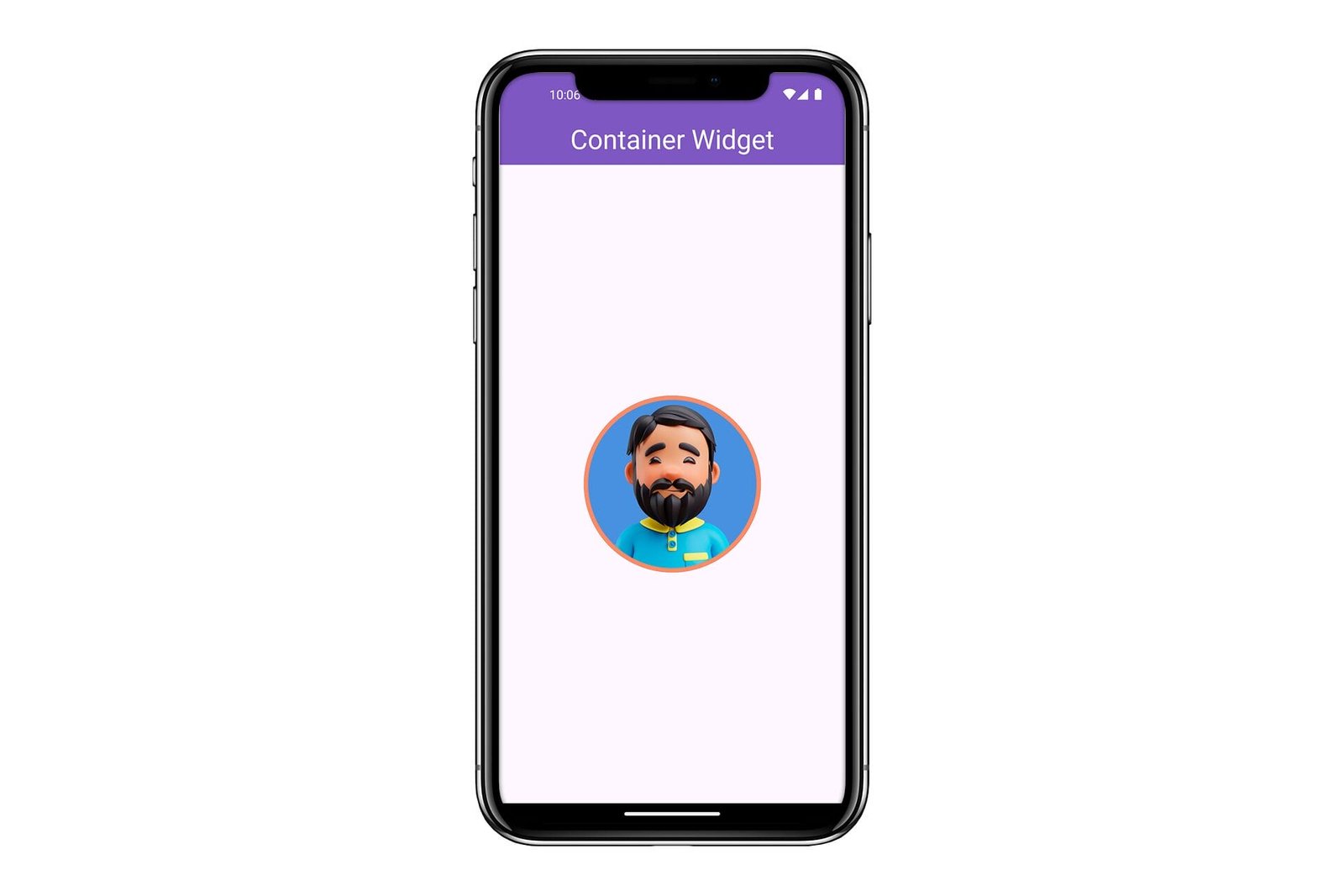
In this example, we create a circular avatar using the Container widget. We set the shape property to BoxShape.circle and use the DecorationImage class to display an image inside the Container.
Example 3: Creating a Gradient Background using Flutter Container
Center(
        child: Container(
          width: double.infinity,
          margin: const EdgeInsets.all(12),
          height: 200,
          decoration: BoxDecoration(
            borderRadius: BorderRadius.circular(12),
            gradient: const LinearGradient(
              colors: [
                Colors.black,
                Colors.blue,
                Color.fromARGB(255, 204, 11, 238),
                Colors.black
              ],
              begin: Alignment.topLeft,
              end: Alignment.bottomRight,
            ),
          ),
          child: const Center(
            child: Text(
              'Gradient Background',
              style: TextStyle(color: Colors.white, fontSize: 24),
            ),
          ),
        ),
      ),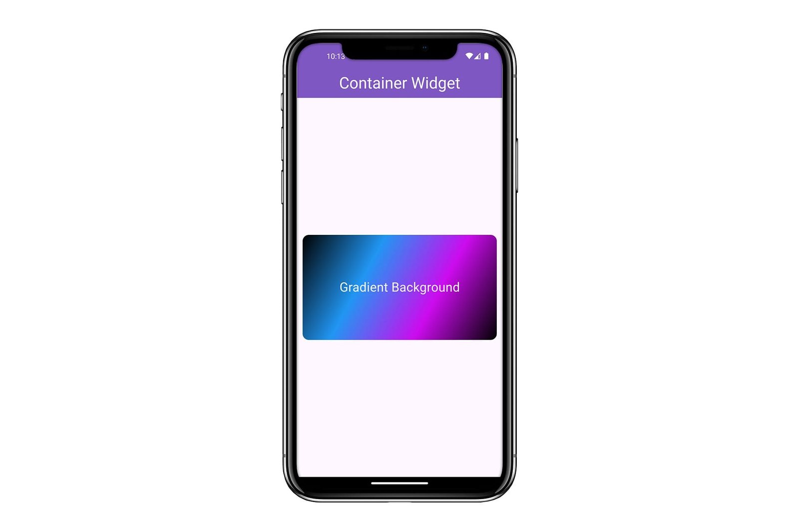
In this example, we create a Container with a gradient background. The LinearGradient class allows us to specify the colors and direction of the gradient. Inside the Container, we center a Text widget.
Conclusion
The Container widget in Flutter is incredibly powerful and versatile, allowing you to create a wide range of layouts and visual effects. By mastering its properties, you can build complex and visually appealing UIs with ease. Whether you’re adding padding, margins, borders, or custom shapes, the Container widget is an essential tool in your Flutter toolkit.
